Thoughts and Research
On my first assignment I did for EVY (Square Mile) I spent far too long on. It led to wasted time and set up the course in terms of time management. So I am going to be extremely mindful of this for this for assignment.
My initial thought on this was keep it simple and quite conservative. How best to approach two sides of the same story? The most natural and first thing that springs to mind is a combination self portrait and persona. I work for the NHS and there is are very obvious public and private personas at play, and of course has healthcare workers we are all healthy people and we all practice what we preach but of course we are human and we are not perfect. The thought was an idea to present the two sides and to a point almost misrepresent my private personas. I drink alcohol but is it to excess, I like junk and fried food but is it to excess, I have smoked but do I still smoke so on and so on against my public role within the healthcare role the activities I undertake.
Another thing I was thinking about for this assignment was an ongoing local news article regarding Derby City shopping centre Intu and the Eagle Centre Market and the effects the big commercial giant has had on the market. I was trying to stay away for a go to cliche subject like rich and poor but I felt that this also had possibilities and had something to offer in that Intu and the eagle centre market share the same retail grounds and are part of the same building complex not only that but Intu has in the last six months brought the market from the local council. It is now the same entity. It is a project that it something that I wouldn’t normally look to do so also services has a way trying something different that pushes me a little outside of my personal comfort zone while remaining quite conservative.
Shopping centre test -
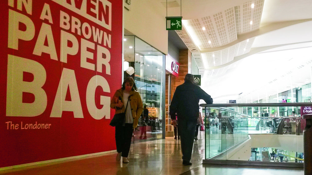
Fig 1. Shopping Centre
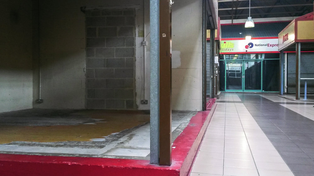
Fig 2. Market
The test images were taken on my mobile, showing clear and obvious two sides of the same story and therefore a success. However on thinking a little more on this idea I believe this story would be quite closed in terms of visual options leading to repetitive, open/closed, busy/empty, rich/poor type images. Although the idea is out of my comfort zone, it was a little to conservative, almost a go-to project. It was an idea that maybe was borne out of the desire to work through this assignment quickly. It didn’t feel like me.
Persona Test - The elements that needed to be thought about was the staging of health care situations, wound care, taking blood and blood pressure seemed logical but needed planning in terms of props and staging. The private persona element would be straight so I decided to carry out test staging.
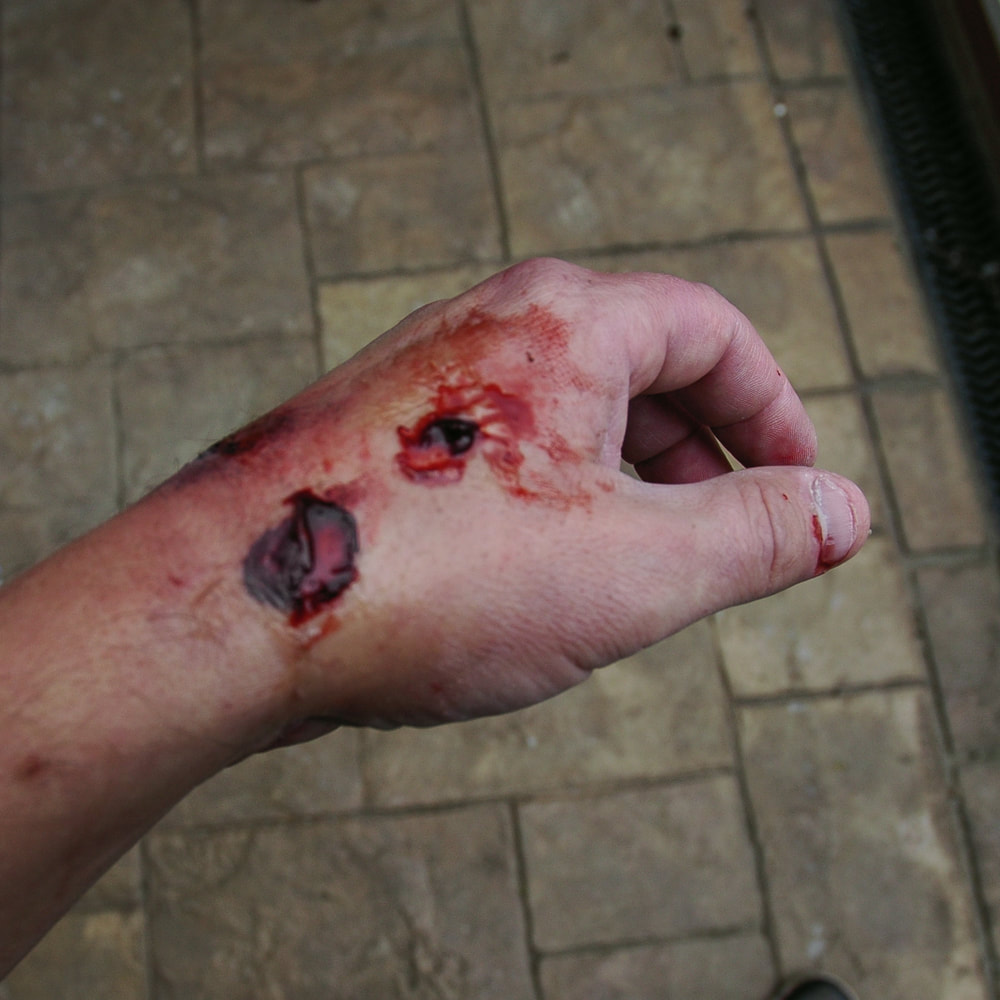
Fig 3. Skin Tear
Skin tear was a simple test to get back into creating a wound something that I experimented with a couple of years ago before this degree. I made the fake blood from scratch using non toxic pva glue, red and blue food dye, the skin tear was created using liquid latex and some cheap face paint to blend it all together.
I also staged taking blood using out of date stock and some fake blood in the bottle, of course making sure to not to inflict any injury on the model (my wife) who placed trust in abilities. Of course I tested the whole thing on myself to ensure it was safe to continue with the test image. The test image is a self portrait and taken on a 10 second timer.
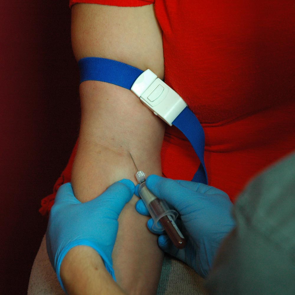
Fig 4. Taking Blood.
The square format was used to close in the images, I wanted to isolate the task, I wanted to remove all other background context.
Has soon has I reviewed the images in camera I could see straight away it was never going to work for me it was to direct, to focused. It is an event that had little room for the viewer. Even if I continued to try out the private element for this idea it wouldn’t work. It just didn’t feel right.
So I continued just taking portraits and self portraits on the 10 second timer, one continuous light. I tried straight deadpan portraits, I got my model to write one word notes about how she sees herself.
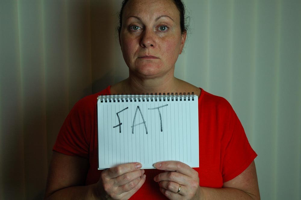
Fig 5. Fat
One image out of the shoot one image out of 200 stood straight out. The gaze with its direct address was stark, body positions square almost unflinching, composition simple and straightforward. A self portrait with my wife, my lover, my bestfriend and the mother to my beautiful children. And yet the space and distance between the two of us seems to lie, all of this tension without any real context created a possible narrative, we begin to form opinion on what is happening or has happened. This is something to work with.
One image out of the shoot one image out of 200 stood straight out. The gaze with its direct address was stark, body positions square almost unflinching, composition simple and straightforward. A self portrait with my wife, my lover, my bestfriend and the mother to my beautiful children. And yet the space and distance between the two of us seems to lie, all of this tension without any real context created a possible narrative, we begin to form opinion on what is happening or has happened. This is something to work with.
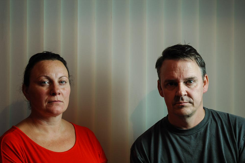
Fig 6. Distant
On the same day and the days running up to this shoot - I was not feeling the love for photography I felt flat and I didn’t really know what to do, I had been just shooting stuff around the house mundane images something that were less than flattering. I have been shooting in the kitchen (I named the photographs - The Shit Tip Kitchen) for a few months mainly images of the mess the kitchen gets into - this started out of boredom. For some reason I found them interesting. I posted one or two up in forum and I told my wife what I had done, she was not best pleased. I tried explaining that all kitchens are like it at some stage during the day and I was ordered not to post anymore photographs of this type.
I left it and a few weeks later, I posted the same image on facebook just to see the reaction I would get in general. She went mental, because she believed that everybody in facebook land would think she really lived like this all of the time. Many people replied that the kitchen was pretty clean unlike their own kitchen of course this didn’t easy her anger. In fact from time to time I have to reminder my wife that facebook land is an online presentation of somebody's life and that a few Facebook statues and photographs is not a true representation and that she should not make comparisons. This fits with private and public persona, and how we screen and censor the images and posts we put on facebook in order to present how we want to be seen. Of course this doesn’t just mean the positive but also the negative.
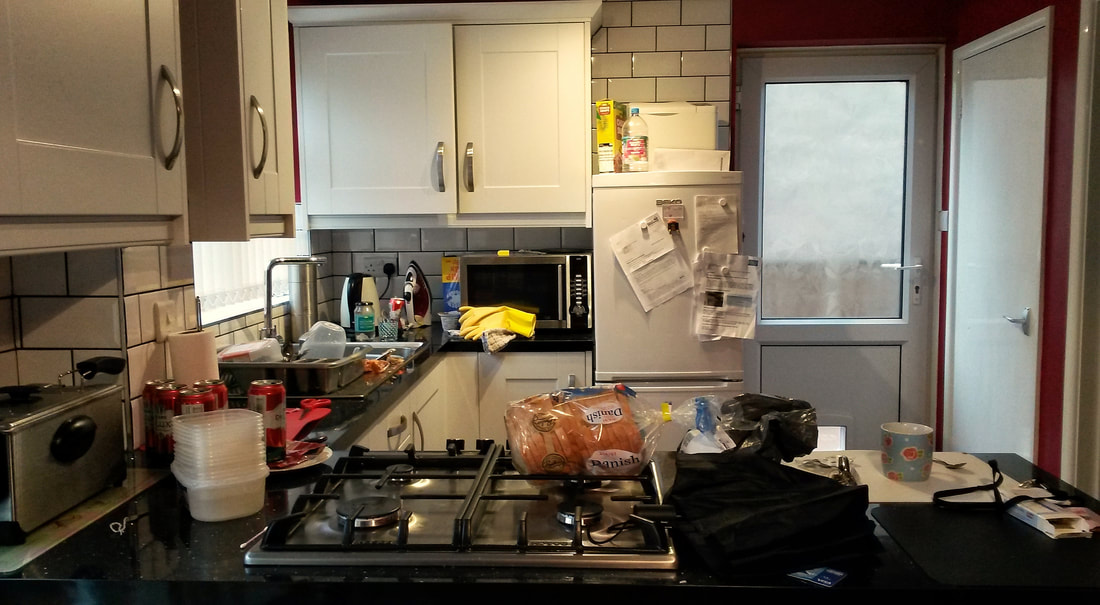
Fig 7. The Shit Tip Kitchen
I thought about the portrait and facebook, it is not one you would personally post to show how much fun you was having, how great your life is, how much you love each other, you wouldn’t post this if you had fallen out, had a bad experience, how bad life was, or how boring it can be. Facebook seems to be very on or off in terms of experience and everything in between is just random but no matter what, the majority of personal photos we post are positive reflections, a representation.
This led to idea of, how would the portrait look alongside a typical personal post in facebook land. So I made a composite image using a number of screenshots of facebook posts and the portrait.
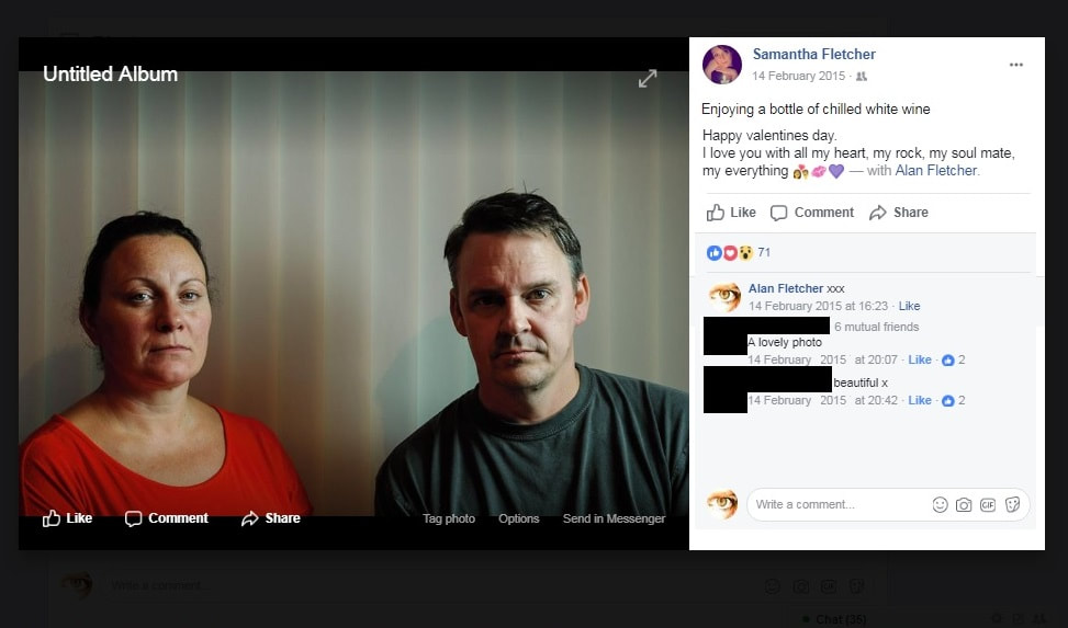
Fig 8. Life is Good.
The result was interesting but it seemed that the facebook format reduced the impact of the portrait, it was the conflict I wanted to explore, the two sides of people's life and online representation. Maybe it is too busy, but the conflict I had was the distance of facebook combined with the distance seen within the portrait seemed to mute maybe even too numb it was over effective it had neutralised itself.
On the forum I sort the feedback from others @Clive suggested maybe postcards could be a different approach, joking that “social media soooooo over”.The postcard is after all an old social communication, short, sweet messages sharing happy, fun and positive experiences from afar alongside a nice photo.
It’s the Suitcase from EVY assignment 5 again, it seems to be haunting me. I thought I could stay away from it in this unit. It is front and back, it is inside and outside, it is lost, it is found, it is memory, it is about distance and closeness, and maybe the loneliness we all feel from time to time even in a world full of people, a world full of ghosts, even when we are surrounded by loved ones. Life is good but not always, it is not perfect and we mask, screen and censor.
The suitcase contained at least a 100+ postcards all untouched, collected memories with no written messages. Could this old way of social communication - a post. Work alongside this portrait? Conflicting photographs and communications, two sides of the same story and two sides of the same surface, two different times a temporal disjunction.
The suitcase is complex project but initially born out of my lost of my mother and that these found images almost became my surrogate photographs for the photographs I lack of her.
Why is the suitcase a symbol for me, why does it come back to my mother. I thought about how the lost seemed like being estranged, I dream about her from time to time, I she never speaks I have had dreams in the past where she returns home after years will she never died just wanted to disappear not wanting to be found. So many questions never to be answered just silence. It’s been 13 years since she died (2004) at the age of 49 the same year facebook started, in fact it was in facebook that lead me to the man who found the suitcase and led to me being in possession of the suitcase. She never used facebook or knew about it, she texted sure but postcards were more familiar. I thought about the postcards, I thought about the suitcase, I thought about what would I write to my mum? How would I cover the important things that have happened and changed in the 13 years that have passed on a postcard, how could I present portraits of everything in between? A Postcards, a suitcase and a wish you were here.
I started to scan the backs of the postcards, print, write and test out the idea.
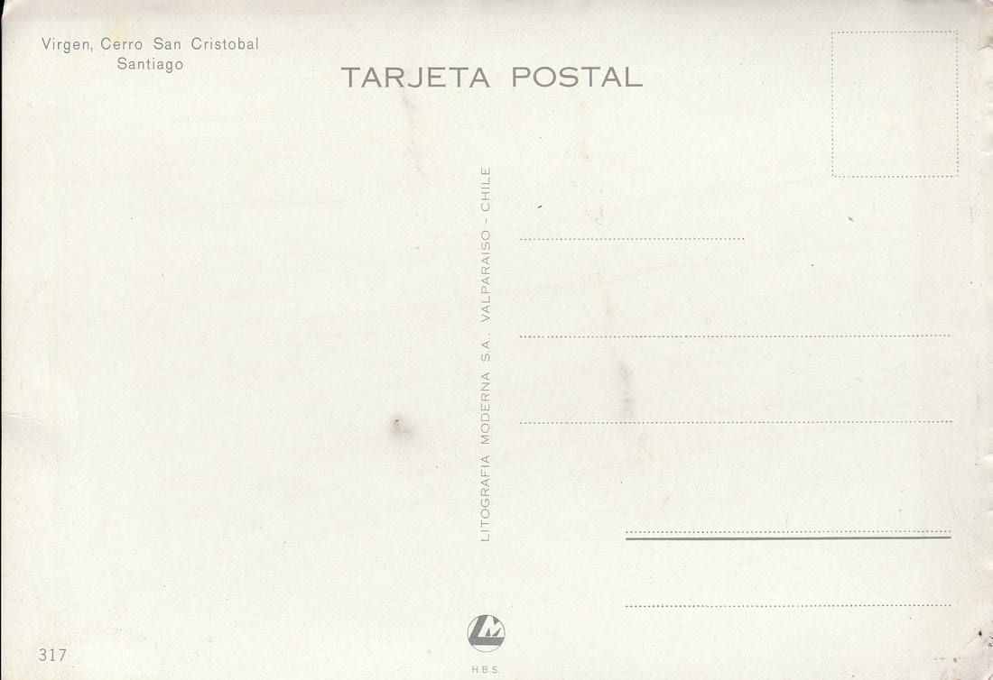
Fig 9. Postcard
I needed to text to be honest and authentic but in a way that is open but doesn’t directly lead the viewer to what it is. Something that is personal to me, something that doesn’t say “Mum” that has no direct signs of death or being overly sentimental.
The postcard was I think the earliest form of social media, a way of letting people know what they was doing, where they were and what it was like. Commonly sent when people were on there travels, photographs and pictures of the places they visited. Kodak produced a camera in 1907 that took photographs in postcard format and could be printed with a postcard back this is analog facebook of their era. A personalized photograph with a written message on the back of course I imagine that this would have only be accessible to the wealthy and these postcards are place I can afford to visit
The work is in part a continued exploration of the object and memory, its front and back surface and how it feels to hold, connect, explore and examine. Everytime I pick up a photograph I instinctively flip it over, looking for additional information - a date, a message, another layer of detail in the hope the memory may become clearer. The front and back never seen at the same time but still shares the same space.
The portraits almost misrepresentation to the point somebody could draw their own negative overview of this family unit, this could be reinforced when paired with the surrounding environment, the bare undecorated cracked walls, the untidy kitchen the deadpan presentation the portraits with their distant disconnected stark and cold stance. We focus on the highs and we miss out the everyday and the inbetweens. I am looking at them and they are looking at me. Of course I know the truth, the setting of the photographs and my intent. They were taken in the middle of decorating after not long moving into a new house, the kids laughing when being directed not to do anything, don’t smile looked bored, my wife really not happy when photographed in a shit tip kitchen the aftermath of general mess at the end of a day of solid decorating stop down tools a few beers, a take away I can’t be arsed we will sort it in the morning.
Regarding the assessment submission because the work is a Postcard format to remain true itself it needs to be presented in such a way but could also be presented in a different way accordion or book format. This could add a different layer the text present next to the following image which could create further disjunction.
Magical thinking driven by the carrots of happiness, success and the everyday christmas wish list. Living for the weekend and dreaming of the next. Holidays and family snapshots, we pass each other along the way. We share trophies on the mantelpiece, the everyday banality hidden away in the dusty draws. This is not a true representation of my life or how I feel all of the time, it is a photograph, a feeling, a thought in brief in time, it is a an exaggeration of the inbetweens.
The juxtaposition of the deadpan and the postcard text the objective and the subjective I believe helps creates a possible narrative not for me I know why I made and what I made. But for the viewer who adds their own experience and interpretation, things that are beyond my control.
The postcards are places I have never been to, places I can only ever dream about, a destination without an address.
The work is self exploratory and indexical in nature not just via photograph but also via the postcard and the text that is scribed on its surface. They both share and connect even though they are presented separately, even in light that they are conflicting. It is the idea of ontology self study of being.
Susan Sontag points out
“A photograph passes for incontrovertible proof that a given thing happened, the picture may distort, but there is always a presumption that something exists, or did exist which is like what’s in the picture”
(Sontag 1977;5) on photography
And yet the work is also symbolic in that the postcard and the text does not openly look like or reflects what’s is within photograph.
“A sign that is symbolic is not caused by a material relationship to its object”
The postcard and text is memento mori without a direct signal of death, a letter to heaven in the form of a postcard if you like - although I don’t believe in any religion or god but for whatever reason the idea of beyond gives me a sense of comfort I guess it is a way to offload. It is a what if, what would I say if. It is an imagined future because my mother's future end with her 13 years ago. It is seated in the past but presented in the present, the somewhere and nowhere. Something from the past and a future that has not happened viewed in the here and now like a ghost. It is similar to the idea of Derrida’s Hauntology something that I have yet to really understand like most of the critical theory and various philosophies that run within photography at some level.
The text almost reflects some notions of “Spectacle of society” the idea that we represent ourselves and experiences in short text and positive photographs to reinforce the message. We focus on the big events and dodge, skimming over the everyday. The system drives consumerism that alienate us, creating distance via the virtual world of the internet we forget the everyday. We aspire to the trophies of success, we display the perfection of family and relationships we have and share, we display them publicly and we leave everything else behind we do this via the photograph alongside the short posts on social media platforms we all continue to chase happiness, comparing and measure ourselves against these snapshots that have been screened, selected and presented in the best possible way.
The act of writing letters to the dead is not a new thing. The ancient egyptians wrote to there recently deceased relatives, they wrote on pottery, papyrus and linen.
http://www.ucl.ac.uk/museums-static/digitalegypt/literature/religious/lettersdead.html
This type of writing continues today, the act of writing letters to the deceased and attaching them to balloons so they fly to the heavens. The subject of death, mourning, memory, remembrance, belief systems, social attitudes is so culturally and anthropologically vast and complex it something I am not even scratching the surface.It may seem morbid but it is important, something in british culture we avoid until we come into contact with it and even then we try our best to avoid having to talk about it.
The postcards are devoid of a real stamp because there is no real address, the blue dot featured in the suitcase it is part of it, the blue dot is the stamp for the postcard, a symbol of a balloon. We seek comfort in the idea of a continued journey, that it is not the end, we continue to remember and that we try not forget so their journey continues after death in the form of a memory on a physical surface or object. It is not just a remember we will all die, but remember in death we will continue
Of course these thoughts are afterthoughts. The possible theory and where the work may or may not sit is of no concern because the work is not made for that purpose to is made for me. People will view this work, interpreting and view it via their own experiences their world. But I hope that the work creates a tension and a disruption between the photograph and the text and at least creates a question, what is happening here? Hopefully further questions of what is the relationship between the people in the photographs and the postcards? Who is the postcard it meant for? Hopefully I have left room for other people to move into even though it is made out of personal intention. It is a construct.
There is the deadpan aesthetic and is there to express the inbetweens of life, how we sometimes feel the mundane. The elements of the everyday we don’t openly share, a snapshot of emptiness, sadness, isolation and nothingness. It is the background within the photographs that are more important than the focus of the people within the frame. I do believe that this adds a trigger but would be fairly weak on its own, but the postcards strengthen this trigger. The photographic series would not work it is own and the postcards series would not work on its own but together it forms a narrative they become entwined in the absence obvious commonality.
However I am unsure whether the text is too leading I cannot gauge this or its impact on the viewer, it could be seen has a lazy route to deflecting the weakness in the narrative within the photographic element of series. It is me and it feels right but intuition is not an excuse to consider that it steadfast.
